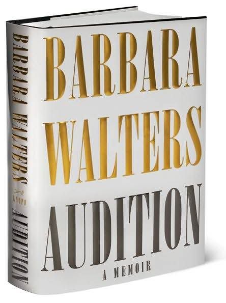
Take a look for yourself at the rough edges / inconsistent finish on this typeface (I'm looking primarily at the ends of the letters):


wtf?
UPDATE: I saw a poster someone had printed at school using onyx, and I pointed out to my teacher the issues (which I was able to see upon close inspection). I also looked on a copy of Audition, and they had fixed the problem there. I'm sure you can buy nicer versions someplace. When I have money I'll probably buy it and erase this *&&%!# version.
UPDATE x2: I found a new, better copy of Onyx. It's called Onyx MT, but I don't know what that means.


 Posts
Posts